
Configuration
Layout & Design
The design of the website is defined in a few files and can be adjusted easily.
Colors & Themes
Colors and some other style parameters are mainly set in the klHarriettesTheme within the file src/plugins/vuetify.js. For details of the project structure see here. The colors are set wherever applicable using the predefined Vuetify color scheme
const klHarriettesTheme = {
  dark: false,
  colors: {
    background: colors.pink.darken4,
    surface: "#FFFFFF",
    'on-surface': colors.pink.darken2,
    'surface-bright': colors.pink.lighten3,
    'surface-button-light': colors.pink.lighten4,
    'on-surface-button-light': colors.pink.darken3,
    'surface-light': colors.pink.lighten5,
    'on-surface-light': colors.pink.darken3,
    'surface-variant': colors.pink.darken3,
    'surface-cta': colors.teal.darken2,
    'surface-snackbar-success': colors.green.darken3,
    'surface-snackbar-error': colors.red.darken3,
    'on-surface-cta': '#FFFFFF',
    'on-surface-variant': colors.white,
    'on-surface-bright': colors.pink.darken4, // primary color!
    primary: colors.pink.darken3,
    'primary-darken-1': colors.cyan.accent2,
    secondary: colors.pink.lighten5,
    'secondary-darken-1': colors.green.lighten4,
    'error-snackbar': colors.red.darken3,
    error: colors.amber.darken3,
    info: colors.pink.lighten4,
    success: colors.green.darken3,
    warning: colors.orange.darken3,
    'avatar-border-color': colors.teal.darken3,
  },
  variables: {
    'border-color': colors.pink.darken2,
    'border-opacity': 0.85,
    'high-emphasis-opacity': 0.87,
    'medium-emphasis-opacity': 0.75, // change form placeholder color here
    'disabled-opacity': 0.38,
    'idle-opacity': 0.04,
    'hover-opacity': 0.04,
    'focus-opacity': 0.12,
    'selected-opacity': 0.08,
    'activated-opacity': 0.12,
    'pressed-opacity': 0.12,
    'dragged-opacity': 0.08,
    'theme-kbd': '#212529',
    'theme-on-kbd': '#FFFFFF',
    'theme-code': '#F5F5F5',
    'theme-on-code': '#000000',
    'border-color-root': '#00FF00',
  }
}
TIP
The predefined layers of the Vuetify configuration were not consistently used as intended within this project - experimenting with the result in the preview was the preferred working mode ✨
Vuetify allows adding further surface on-surface color sets which define a background color and the text color used on this background respectively
Vuetify also allows to clone its components and apply own styling to it by using so-called aliases. This is implemented in the same file as the theme and applied for some often used components in this project:
aliases: {
  VSheetTitleHero: VSheet,
  VSheetDetailHero: VSheet,
  VSheetTitle: VSheet,
  VSheetTitleP: VSheet,
  VSheetTitle: VSheet,
  VSheetDetail: VSheet,
  VSheetSideTag: VSheet,
  VSheetNameTag: VSheet,
  VSheetNameTagHero: VSheet,
  VSheetNumTitleHero: VSheet,
  VSheetNumDetailHero: VSheet,
},
defaults: {
  VSheetTitleHero: {
    class: [ 'v-sheet--title-hero', 'bg-surface-variant', 'text-subtitle-1', 'text-lg-h5',  'font-weight-bold'],
  },
  VSheetDetailHero: {
    class: ['v-sheet--detail-hero','text-body-2', 'text-md-body-1', 'px-2', 'py-2'],
  },
  VSheetTitle: {
    class: ['v-sheet--title','bg-surface-variant', 'text-subtitle-2', 'text-md-subtitle-1', 'px-4', 'py-1', 'font-weight-bold'],
  },
  VSheetTitleP: {
    class: ['v-sheet--title','bg-surface-variant', 'text-subtitle-1', 'text-md-h6', 'px-4', 'py-1', 'font-weight-bold', 'rounded-t-lg', 'text-center'],
  },
  VSheetDetail: {
    class: ['v-sheet--detail','text-body-2', 'text-md-body-1', 'pa-2'],
  },
  VSheetSideTag: {
    class: ['v-sheet--side-tag','text-subtitle-1', 'text-sm-h6', 'font-weight-bold', 'text-primary']
  },
  VSheetNameTag: {
    class: ['v-sheet--name-tag','text-h6', 'font-weight-bold', 'text-primary', 'text-center']
  },
  VSheetNameTagHero: {
    class: ['v-sheet--name-tag-hero','text-subtitle-1', 'text-sm-h6', 'font-weight-bold', 'text-primary']
  },
  VSheetNumTitleHero: {
    class: ['v-sheet--num-title-hero', 'bg-transparent', 'text-secondary', 'text-body-2', 'text-md-body-1']
  },
  VSheetNumDetailHero: {
    class: ['v-sheet--num-detail-hero', 'bg-transparent', 'text-subtitle-2', 'text-subtitle-1']
  },
},
Favicon and Logos
The favicon is set in index.html by adding a link to the bunny.svgfile
<!DOCTYPE html>
<html lang="en">
  <head>
    <meta charset="UTF-8">
    <link rel="icon" type="image/png" href="/favicon-96x96.png" sizes="96x96" />
    <link rel="icon" type="image/svg+xml" href="/favicon.svg" />
    <link rel="shortcut icon" href="/favicon.ico" />
    <link rel="apple-touch-icon" sizes="180x180" href="/apple-touch-icon.png" />
    <meta name="apple-mobile-web-app-title" content="KLH3" />
    <meta name="description" content="The official website of the KL Hash House Harriettes, a Hash Chapter in Kuala Lumpur, Malaysia.">
    <meta name="viewport" content="width=device-width, initial-scale=1.0">
     <meta name="theme-color" content="#AD1457">
    <title>Welcome to the KLHHH</title>
  </head>
  <body>
    <div id="app"></div>
    <script type="module" src="/src/main.js"></script>
  </body>
</html>
The logos in the header and the footer (copyright) are loaded and rendered through the respective components
AppHeader
<v-toolbar-title data-testid="app-header-logo">
  <router-link to="/">
    <v-img src="@/assets/img/bunnies_header-white.svg" :height="appBarHeight"></v-img>
  </router-link>
</v-toolbar-title>
AppFooter
<RouterLink to="/signinsheet">
  <v-img data-testid="login-link" src="/src/assets/img/bunnies_header-white.svg" style="width:200px" class="flex-grow-0"></v-img>
</RouterLink>
The bunny logo as part of the navigation drawer (top most icon) is also rendered by the AppHeader component
<v-list-item  data-testid="menu-bunny" class="pl-5" prepend-avatar="@/assets/img/bunny_white.svg" title="KL Harriettes"
  subtitle="Running since 1974" to="/">
</v-list-item>
Layouts
The layout of the website is implemented using the default.vue file in src/layouts. It implements the background by applying a <style> block:
<style>
.bg {
  /* Make sure `v-main` fills the entire page height */
  min-height: 100vh;
  height: auto;
  /* Background properties */
  background: url('@/assets/img/Picture1.png') no-repeat center center;
  background-size: cover;
  background-attachment: fixed;
}
</style>
which produces the colored "starry night" background.
The <template> section of this file adds the AppHeader and AppFooter component:
<template>
    <AppHeader/>
    <v-main app class="bg mt-6">
      <div class="d-flex d-sm-none flex-row justify-center align-center mb-6">
        <v-btn
          data-testid="run-with-us-button-mobile"
          to="/contact"
          color="surface-cta"
          style="border: 2px solid white;"
          class="flex-0-0"
        >
        Run with Us!</v-btn>
      </div>
      <OfflineStaleBanner />
      <router-view />
    </v-main>
    <AppFooter />
</template>
The tree silhouettes on the left and right lower corner of the screen are added only on the landing page (on other pages it makes the content difficult to read) using the component OverlayImages
This layout is used throughout the entire website except the /signinsheet path. For this an empty.vue layout template is used providing more Whitespace on the page for easier handling. The layout is identical to default.vue but does not load the AppHeader and AddFooter components.
Progressive Web App
As outlined here the PWA is configured as part of Vite in the VitePWA plugin which injects the necessary settings and files into the final build output of the website. Additionally, to ensure seamless versioning of the PWA some functions are implemented in main.js which are also explained here.
VitePWA plugin
The configuration of the VitePWA plugin is embedded in the Vite configuration in vite.config.mjs in the projects root folder has two relevant sections. In the main part
VitePWA({
  // devOptions: {
  //   enabled: true, // ✅ enable SW in dev mode
  //   type: 'module', // or 'classic', depending on your sw format
  //   navigateFallback: 'index.html', // optional
  // },
  registerType: 'autoUpdate', // auto register + update
  injectRegister: 'auto',
  manifest: {
    name: 'KL Hash House Harriettes Website',
    description: 'The official website of the KL Hash House Harriettes, a Hash Chapter in Kuala Lumpur, Malaysia.',
    short_name: 'KLH3 WebApp',
    start_url: '/',
    display: 'standalone',
    background_color: '#AD1457',
    theme_color: '#AD1457',
    icons: [
      {
        src: 'img/app-logo_128x128.png',
        sizes: '128x128',
        type: 'image/png',
      },
      {
        src: 'img/app-logo_192x192.png',
        sizes: '192x192',
        type: 'image/png',
      },
      {
        src: 'img/app-logo_512x512.png',
        sizes: '512x512',
        type: 'image/png',
      },
    ],
    screenshots: [
      {
        src: "img/screenshot-desktop.png",
        sizes: "1281x720",
        type: "image/png",
        form_factor: "wide"
      },
      {
        src: "img/screenshot-mobile.png",
        sizes: "640x1138",
        type: "image/png",
        form_factor: "narrow"
      }
    ]
  },
the way how the service worker is registered and updated (both set to auto) as well as the manifest of the PWA is defined. The manifest is a JSON file that describes a Progressive Web App — it contains the app’s name, icons, theme, and display settings, so it can be installed like a native app.
In the second part
workbox: {
  // Pages to cache at runtime
  cleanupOutdatedCaches: true,
  clientsClaim: true,
  skipWaiting: true,
  runtimeCaching: [
      // Do NOT cache the ping endpoint, as it is used to check if the backend is reachable
      {
        urlPattern: new RegExp(`${backendPath.replace('/api', '')}/ping(?:\\?.*)?$`),
        handler: 'NetworkOnly',
        options: {
          cacheName: 'ping-cache',
        },
      },
      // We do not want to check against stale accounts!
      {
        urlPattern: new RegExp(`${backendPath}/users/me`),
        handler: 'NetworkOnly',
        options: {
          cacheName: 'users-cache',
        },
      },
      // Cache all calls to the admin backend media files
      {
        urlPattern: new RegExp(`${backendPath.replace('/api', '')}\/uploads\/.*`),
        handler: 'NetworkFirst',
        options: {
          cacheName: 'image-cache',
          expiration: {
            maxEntries: 100,
            maxAgeSeconds: 30 * 24 * 60 * 60, // 30 days
          },
        },
      },
      // Cache all images
     {
        urlPattern: new RegExp('\\.(?:png|jpg|jpeg|svg|gif|webp|ico)$'),
        handler: 'CacheFirst',
        options: {
          cacheName: 'image-cache',
          expiration: {
            maxEntries:200,
            maxAgeSeconds: 30 * 24 * 60 * 60, // 30 days
          },
        },
      },
      // Cache all calls to the admin backend endpoints
      {
        urlPattern: new RegExp(`${backendPath}/.*`),
        handler: 'NetworkFirst',
        options: {

          cacheName: 'api-cache',
          expiration: {
            maxEntries: 100,
            maxAgeSeconds: 60 * 60 * 24 * 5, // 5 days
          },
        },
      },
  ],
},
the runtime cache is configured within the Workbox section. The three parameters at the beginning define the behavior of caches and service worker on update:
🗑️ cleanupOutdatedCaches: true Removes any old caches that were created with earlier versions of the service worker, keeping only the latest.
👥 clientsClaim: true Lets the service worker take control of open pages as soon as it activates — no page reload required.
⏩ skipWaiting: true Forces a newly installed service worker to activate immediately, skipping the “waiting” state.
Following this, runtime caches are defined, where each definition includes the URL/file to be cached, the caching strategy (handler) and options defining how large the cache can become and how often entries must be refreshed.
INFO
the precache (see also Figure 6) is automatically generated and managed by the Vite build process in cooperation with the Vue.j/Vuetify setup and does not need to be configured independently.
WARNING
As outlined elsewhere, at the time of writing this, the update of a service worker and the corresponding cache refresh does not seem to work reliably. More often than not, a page reload and sometimes even a deletion of the browser cache is required until a new app version is available.
main.js
NOTE
Most of the functionality below is already implemented by the VitePWA plugin - this seems to work however rather reliably, so again, never change a running system 😇
To make sure that
- the service worker
sw.jsis updated properly and - caches and
indexedDBare wiped completely at every service worker update
two measures are implemented:
- an
APP_VERSION(timestamp) environment variable is automatically created withinvite.config.mjs
define: {
  __APP_VERSION__: JSON.stringify(formatted),
},
and persisted in indexedDB during application start.
- some handling functions are implemented in
main.jswhich enforce a check of theAPP_VERSIONevery hour. If theAPP_VERSIONchanged,- the
APP_VERSIONinindexedDBwill be updated - caches and
indexedDBwill be wiped out - the page will be reloaded.
- the
The following sections describe the handling functions in detail:
onNeedRefresh
Shows a confirmation dialog to the user when a new service worker is available. If the user clicks "OK", the updateSW function is called with forceReload set to true. This will reload the application with the new service worker.
INFO
Currently not in use, to not confuse end users
onRegisteredServiceWorker
This function is only called when a service worker is registered and checks for updates of the service worker every hour.
- The
registrationobject is only available if the service worker is registered successfully. - The
registration.update()function is used to periodically check for updates (every hour).
checkVersionAndClearCaches
Checks if the current version of the app is different from the stored version in indexedDB. If so, it clears all caches and reloads the app.
checkAndCleanOnUpdate
This function retrieves the stored app version, compares it with the current version, and if necessary, calls checkVersionAndClearCaches to clear caches and reload the app. It then updates the stored version to the current version.
Caching
Besides configuring the precache and the runtime cache of the Workbox, it must be ensured that files like the sw.js are not cached at all. The respective configuration of nginx can be found here and the configuration of the cloudflare bypass cache rules here
Routing
In this project we mainly use the routes generated by the unplugin-vue-router plugin. We have to implement the re-routing to 404-error page here, which is implemented in /src/router/index.js though:
const router = createRouter({
  history: createWebHistory(import.meta.env.BASE_URL),
  routes: [
    ...setupLayouts(routes),
    {
      path: '/404',
      name: 'NotFound',
      component: NotFound,
      // meta: { layout: 'default' },
    },
    {
      path: '/:pathMatch(.*)*',
      redirect: '/404',
    },
  ],
})
Google Maps API key
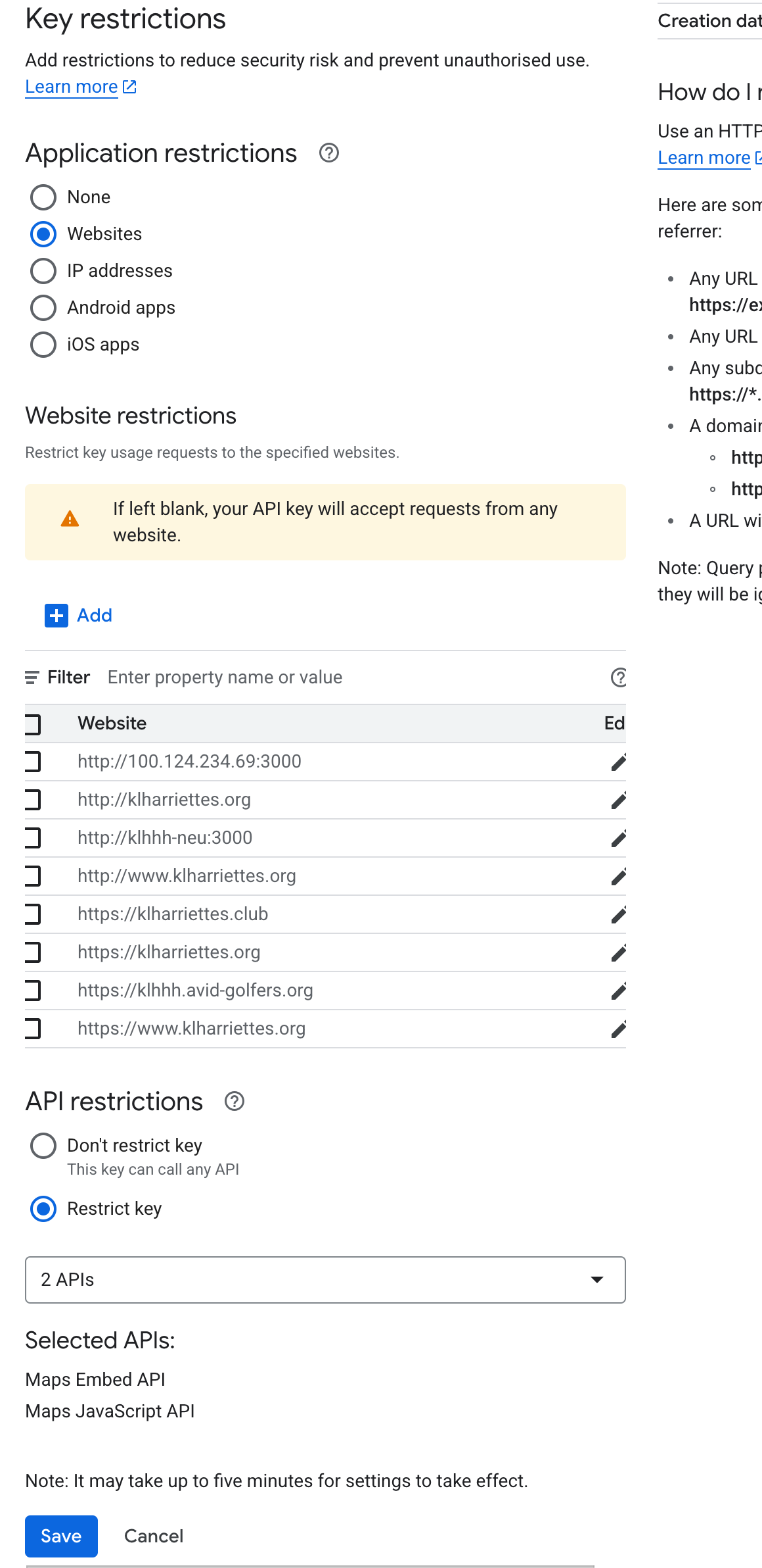
To display the maps on the /locations pages a Google Maps API key is required. The key should be restricted to the Maps Embed API and Maps JavaScript API as well as to the domains accessing it. For an example see the screenshot below.
To set up the key follow the steps below:
- Create a Project in Google Cloud Console
- Go to: https://console.cloud.google.com/
- Create a new project or select an existing one.
- Enable the Required APIs
- Navigate to APIs & Services > Library
- Enable:
- Maps JavaScript API
- Maps Embed API
(Optional: Places API, Geocoding API depending on use)
- Create an API Key
- Go to APIs & Services > Credentials
- Click “Create Credentials” > API Key
- Restrict the Key
Click on your newly created key
Set the following:
🔐 Application Restrictions:
- Websites → Add:
- https://yourdomain.com
- https://www.yourdomain.com
- http://localhost:3000 (for dev, or use a separate dev key)
🔐 API Restrictions:
- Select: Restrict key
- Choose only the APIs you need (e.g. "Maps JavaScript API", "Maps Embed API")
- Websites → Add:
- Save and Wait ~5 Minutes
- Settings may take a few minutes to take effect
WARNING
The key currently used on the KLH3 Website is attached to the private Google Developer Account of the Author